MAGAZINE DESIGN
CARPE NOCTEM MAGAZINE
ROLE
Design Lead
TOOLS
Illustrator, Photoshop
YEAR
2022 - 2023
Carpe Noctem is a student-run literary and arts magazine created to amplify young voices through creative writing, photography, and visual art. Over the course of two years, I had the opportunity to serve as the Design-in-Charge, where I led the visual development and layout design for three full issues—each with its own personality, tone, and creative challenges.
I was responsible for:
Establishing the visual identity of the publication
Designing layouts for all three issues
Leading a small team of peers through the production process
Ensuring print and digital formats were polished and accessible
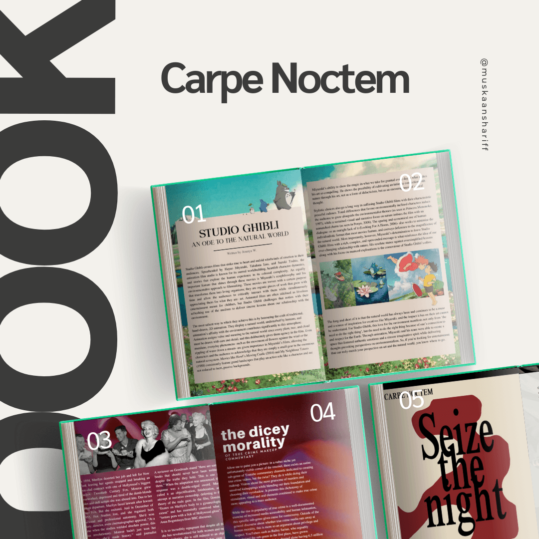
My goal was to make each issue feel unique while maintaining visual continuity across volumes. From bold typographic choices to experimental spreads, each layout was crafted to reflect the tone and content of the student work featured.
As the lead designer, I oversaw every aspect of the magazine’s visual identity—from the cover concept to the smallest typographic details on each page. Working closely with a team of designers, writers, editors and student contributors, I was responsible for translating a diverse collection of content into a cohesive and visually compelling publication. My responsibilities included layout design, typography, grid systems, art direction, and final digital formatting for publishing, ensuring the final product was not only readable but also immersive and engaging.
I was responsible for:
Establishing the visual identity of the publication
Designing layouts for all three issues
Leading a team of peers through the production process
Ensuring print and digital formats were polished and accessible
My goal was to make each issue feel unique while maintaining visual continuity across volumes. Each issue of Carpe Noctem had its own theme and emotional tone, so one of my core challenges was designing visuals that reflected these unique narratives while still maintaining brand continuity. I wanted the magazine to feel professional yet expressive—something that didn’t feel like a typical school publication. My approach was to use experimental layouts, thoughtful typography, and selective white space to give each piece of content the breathing room it deserved. The aim was to celebrate student work with the same level of care and polish you’d see in an indie print publication.
Working on Carpe Noctem came with its own set of real-world challenges. Designing for print and digital simultaneously required me to think about resolution, legibility, and layout constraints across formats. One of the biggest hurdles was time management—juggling layout deadlines while coordinating with contributors whose work was still in progress. Since I was also leading the visual team, I had to guide newer designers through their first exposure to tools like InDesign and ensure we maintained a consistent aesthetic across every spread.
Another key challenge was communication—learning to receive and implement feedback from both the editorial team and contributors while standing firm on certain design decisions that would impact usability and visual flow. Balancing artistic integrity with collaboration was a valuable learning experience in navigating creative teamwork.
Check out the Magazine!
Browse the Issues:
🟣 Issue One – 2022
A launch issue focused on mystery, isolation, and expression.
🟡 Issue 1.5 – 2022
A mini-issue with quirky visuals and unconventional storytelling.
🔵 Issue Two – 2023
The most refined issue, with mature themes and a confident visual system.
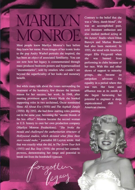
Here are some designed articles from the magazine.


Working on Carpe Noctem helped me grow immensely—not just as a designer, but as a team leader and creative collaborator. I learned how to take initiative, manage a large-scale project from concept to publication, and work through both creative blocks and production hurdles. I gained hands-on experience designing with purpose: making sure every visual choice added value to the reader’s experience, whether that was through a bold headline treatment or a minimalist layout that let a poem breathe.
This project also deepened my appreciation for storytelling through design. I wasn’t just placing text and images on a page—I was helping bring student voices to life. That sense of responsibility taught me to design with empathy, intention, and attention to the emotional impact of visual language.