Webs design
WanderPanda: Your Journey, Your Way.
WanderPanda is a city tourism website designed to enhance the travel experience by providing self-guided tour information, including maps, routes, tips, accommodations, and must-see locations. The site also offers a language learning tool to assist non-native speakers, making exploration more accessible and enjoyable.
Modern tourists often struggle with information overload, language barriers, and scattered resources when planning their trips. WanderPanda aims to address these issues by creating a centralized, user-friendly platform that offers clear, organized, and accessible travel information, with added language support to enhance the overall experience.
This category details the step-by-step approach taken during the project, including research, planning, design, development, testing, and optimization phases.
Research & Planning
Conducted market research to identify existing websites challenges and user preferences. Defined target audience segments and outlined key features based on user needs and market trends.
Ideation & Wireframing
Created user interfaces and prototypes. Iteratively refined designs based on user feedback to enhance usability and visual appeal. Developed low-fidelity wireframes to establish layout, navigation, and content structure.
Implementation
Built the site using HTML, CSS, and JavaScript, ensuring responsiveness across devices and optimizing for accessibility. Implemented AI algorithm to be used for translation.
Testing & Optimization
Conducted testing across various devices and platforms to ensure compatibility and performance. Gathered user feedback through testing and optimized the app based on usability metrics and user satisfaction.
Here are a few key findings that shaped WanderPanda's purpose and feature set:
Insight
64% of travelers experience difficulty communicating with locals abroad. (Source: Statista Survey 2022)
1 in 3 travelers feel anxious due to lack of clear planning resources. (Source: Expedia Travel Report 2021)
Users prefer itinerary templates to custom planning when time-constrained. (Source: UX Collective (UX for Travel Apps))
Cultural faux pas can be a top source of discomfort when traveling. (Source: Lonely Planet Community Survey)
These insights confirmed the need for the website to:
Provide easy-to-use trip templates
Offer bite-sized local etiquette tips
Include language tools built for practical, in-trip use
Prioritize simplicity and personalization over clutter
I conducted interviews with 5 potential users, including frequent travelers, digital nomads, and casual tourists. The interviews focused on understanding their travel planning habits, pain points, and feature preferences.
Key Insights:
Users wanted a streamlined experience that minimizes excessive clicking and scrolling.
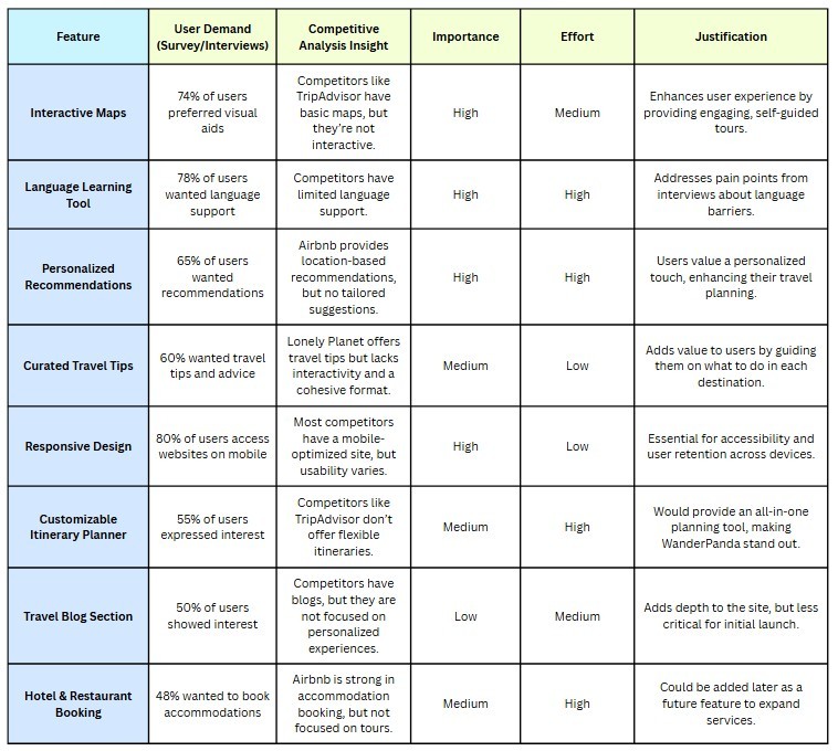
Visual aids such as maps and interactive guides were highly preferred.
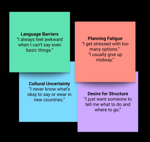
Language barriers were a major concern for non-native English speakers.
Recommendations based on interests (e.g., food, culture, adventure) were considered valuable.
I analyzed popular travel websites like TripAdvisor, Airbnb, and Lonely Planet to identify common features, strengths, and areas for improvement.

Notes and groupings to show insights clustering into patterns.
Made a prioritization table for the features to be included on the website. This helps to prioritize and justify the inclusion of certain features in WanderPanda based on their importance to the users, their feasibility, and gaps in the market.
After conducting interviews and 1 online survey with 10 participants aged 18–35. Across the responses, a common profile emerged: young professionals who enjoy solo or duo travel, want pre-made plans, and care about learning basic cultural context before arriving. This led to the creation of David Lin, a marketing specialist from Seattle, as my core persona.

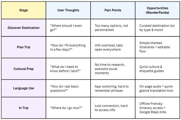
Journey Map showing what the typical user experiences from pre-trip to during-trip
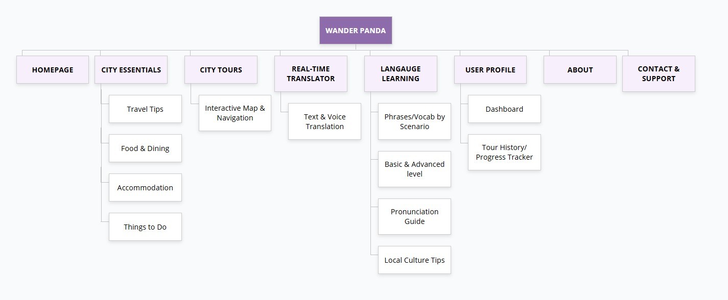
Based on the Prioritization table of the features, I created an Information Architecture to plan the navigation and the pages necessary to create for the website.
Low Fidelity Wireframes
Then designed lo-fi wireframes for the website to figure out the layout before coding the page using HTML, CSS & Java.

Usability Testing
What I Did:
I tested a prototype of WanderPanda’s itinerary and culture/language guide with 3 users. They were asked to:
Choose a destination
Customize a plan
Access culture tips
Test mobile responsiveness
Key Findings:
What Worked
Needs Improvement
Clean layout and fun visuals were praised
Language Translation feature was helpful
Templates saved time and reduced overwhelm
UI works seamlessly on smaller screens
Users wanted better navigation between sections
Some thought cultural tips needed more real-world depth
Needed broader range of recommendations & features
Semi-Final Design & Features
A ton of testing and feedback later, the website was starting to come together.




What I Learned
Next Steps
User-Centered Design:
Throughout the project, I learned the importance of understanding users’ needs and tailoring the website to meet those needs. By conducting interviews, analyzing competitors, and researching user expectations, I realized how essential it is to build a product that aligns with real-world use cases. The insights gained from user research were critical in shaping the features of WanderPanda, ensuring that it provides real value to travelers.UI/UX Integration:
I deepened my understanding of UI/UX principles and how they complement each other. Ensuring that WanderPanda is not only visually appealing but also intuitive to navigate was a challenge that strengthened my design thinking. I learned how important it is to make design decisions based on usability and user feedback rather than purely on aesthetics.Competitor and Feature Analysis:
The process of performing competitive analysis was extremely valuable. I learned how to identify gaps in the market and how to differentiate WanderPanda from other travel websites. Analyzing competitor features helped me understand which features to prioritize and how to implement them in a way that gives users a better experience than what’s currently available.Collaboration with Stakeholders:
If I had worked with real-world stakeholders (clients, users), I would have learned more about incorporating their feedback into iterative design processes. Working with feedback (even from mock users) is a crucial part of creating a user-friendly website. I’ve learned to handle feedback with grace, make necessary revisions, and iterate continuously.Prototyping and Testing:
While the website is still a concept, I learned that it’s essential to prototype ideas and test them as early as possible. Even simple wireframes or mockups allow you to validate your ideas before committing to development. Early testing with users would provide insights into any usability issues that might have otherwise been overlooked.
Usability Testing and Iteration:
The next step is add more features. I’ve gathered user feedback during the research phase, and tested the live website with users which gave me a clearer understanding of the user experience and potential issues. Based on their feedback, I want to refine and iterate on the design to make the website even more intuitive and accessible.
SEO and Performance Optimization:
As a next step, I’ll focus on optimizing the website for SEO and performance. This includes improving page load times, using clean code for faster rendering, and ensuring that images are optimized for the web. SEO optimization will ensure that WanderPanda ranks well on search engines, making it easier for potential users to discover the platform.
Feature Expansion:
As WanderPanda evolves, I plan to add more advanced features, such as:
Personalized User Profiles: Allow users to save their favorite destinations, itineraries, and travel logs.
Hotel and Flight Booking Integration: Include booking options for a full travel experience.
Community Engagement: A section for users to share their travel stories, tips, and recommendations, making the site feel more interactive.